brian froud

Painting the Brambling | Painting a Fantasy Creature Head

Now that the brambling's head is sculpted to my liking, it's time to lay down some paint! When painting a fantasy creature head, it's actually kind of important to ground yourself in realism because bramblings are elusive in the wild! I had to do the next best thing and bring a couple of tree branches into the studio. Who'd have thought realism's the best strategy when painting a fantasy creature head? By looking at this tree branch I could observe that it was largely a warm grey tone with moments of green and brown on it rather than that iconic brown Crayola crayon that we might all instantly imagine.


Watch the Brambling Head Be Painted with Acrylics Here


I used a range of earth-tones in painting the fey creature's head- siennas, umbers, ochers, and greens with touches of grey tones to dull-down the pigments. I also painted the head generally lighter than I would have naturally due to the fact that I was about to embark on trying my hand with an ink wash technique...

EXPERIMENTING WITH INK!

ACRYLIC INK

In painting this head, I tried a technique that was new to me: using an acrylic ink wash with dark toned ink. I had carved a lot of bark texture all over the brambling and I wanted a way to darken the recessed areas that didn't involve my painstakingly painting in dark tones and then carefully trying not to undo this work as I painted-in lighter tones. Before I used the technique on the actual fantasy art doll head, I tested on scrap sculpted piece I had (who'd have thought I was doing myself a favor when I accidentally sculpted two right hands for this art doll?!). Admittedly, I still feel like I can do a better job at highlighting sculpted details with this technique, but overall, I'm happy with the outcome.


If you would like a print of the Brambling final image, you can purchase it HERE.


I hope you enjoyed exploring this magical fey creature as much as I have! To be the first to know when I launch new polymer clay art videos, be sure to subscribe to my YouTube channel and hit the bell icon (but because YouTube's wonky, you can also join the newsletter). Catch all of my videos here:  https://www.youtube.com/thedreamsyndicatearts. You can also find many of the supplies I use in crafting here: https://www.thedreamsyndarts.com/supplies-gear/. Until next time, make believe!

What's With #ArtVsHero?

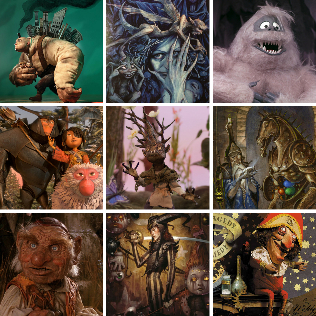
If you spend time lurking artists on Instagram or Facebook or are an artist yourself, you may have seen #artvshero going around. The hashtag started with students of SVS Learn, which was founded by Jake Parker and Will Terry, and is a way for artists to see how they stack-up when surrounded by their art heroes. An artist places their work in the center of a 3-by-3 square grid and literal surrounds their work with the artwork of their influences.


Watch a Discussion on Art Versus Hero Here


I first found-out about this creative exercise on the fantasy/independent artist podcast One Fantastic Week when hosts Pete Mohrbacher and Samuel Flegal had Will Terry as a guest. And I spent some time thinking about it, I found that I'm as influenced by collaborative arts like stop-motion and film design as I am by individual artists and if you've followed any of these artists, there's a through-line, between many of them.


Watch the One Fantastic Week Interview with Will Terry Here


My Art Versus Hero Grid

ArtVs.Hero Will Terry.jpg


Going across each row, the artists (or production companies) are: 

Rednose Studio (an independent artist), Brian Froud, Rankin/Bass Productions, Laika, myself, Tony Diterlizzi, Jim Henson Company, Brom, and Dave McKean. I try to take little bits and pieces of inspiration from all of these wonderful artists with myself acting as a filter. This is by no means an exhaustive list of artists that have influenced my work- I also draw inspiration from many, many more fantastic artists.

Brian Froud worked with Jim Henson films to design the characters for Labyrinth and the Dark Crystal and I know these films were hugely influential on Tony Diterlizzi as early in his career he dreamed of working for Jim Henson. Rankin/Bass produced stop-motion films throughout the 1960's and 70's and it would be easy to see their work informing later animation studios like Laika or the work of Rednose Studio. I love the work of both Rednose Studio and Dave McKean because they've both shown themselves to be near limitless in their process to visually story tell. I also owe Rednose Studio a debt of gratitude for raising the bar for dimensional-illustration! There have been traditional photographed three-dimensional picture books in the past, but they had the unfortunate ability to be unintentionally unnerving (a college friend had showed me a "Goldilocks & The Bears" picture book from decades ago that was nightmare inducing).

To be the first to know when I launch new polymer clay art videos, be sure to subscribe to my YouTube channel and hit the bell icon (but because YouTube's wonky, you can also join the newsletter). Catch all of my videos here:  https://www.youtube.com/thedreamsyndicatearts. You can also find many of the supplies I use in crafting here: https://www.thedreamsyndarts.com/supplies-gear/. Until next time, make believe!